SaveUp
A goal-based savings app that turns a target amount and deadline into a manageable plan, helping users track spending, see progress, and stay motivated.
Responsive Savings App
2024
Overview
Role:
Solo UX/UI designer
Scope:
Research, user flows, interaction design, UI design, usability testing
Platforms:
iOS and Responsive desktop
Status:
Tested concept prototype
Timeline:
5 weeks
Testing:
5 participants
Problem
The Problem
Saving toward a specific goal can feel overwhelming when users don’t know how much to save, how often to contribute, or whether their spending is putting them off track.
Saving toward goals within a timeline is a common challenge
Visual feedback is clinical when the user is already stressed about money
The Solution
A cross-platform savings app for users who want to set a goal, track progress, and stay motivated without becoming a personal finance hobbyist.
SaveUp turns goal-based saving into a visual, low-friction habit. Users set a target amount and deadline, receive a weekly savings plan, and track progress through clear dashboards, category feedback, and warning states.
Target Users
Adults saving toward short- and medium-term goals
Core Need
Clarity and motivation without rigid budgeting
Design Approach
Goal-first planning · Visual feedback · Cross-device continuity
Research-Informed User Profile

Key User Needs
Visual expense overview
"I want to see how much I'm spending on what"
Design decision:
Created a dashboard with category breakdowns, progress indicators, and a persistent spending summary.
Personalized savings plan
“Tell me how much to save each week so I can reach my goal.”
Design decision:
Built a guided goal flow that converts a target amount and deadline into a weekly savings plan.
Income and expense input
“I want to record spending without navigating a complicated budget.”
Design decision:
Designed one transaction flow with category tagging and collapsible spending groups.
Goal deadlines and progress
“I want to know when I’m overspending before it’s too late.”
Design decision:
Added warning states for categories approaching or exceeding the planned amount.
User Flow


Wireframes
I mapped the core paths for expense tracking, goal creation, and progress review before applying visual styling.
The dashboard evolved from task mapping to structured information and actionable financial feedback.


Visuals
Logo
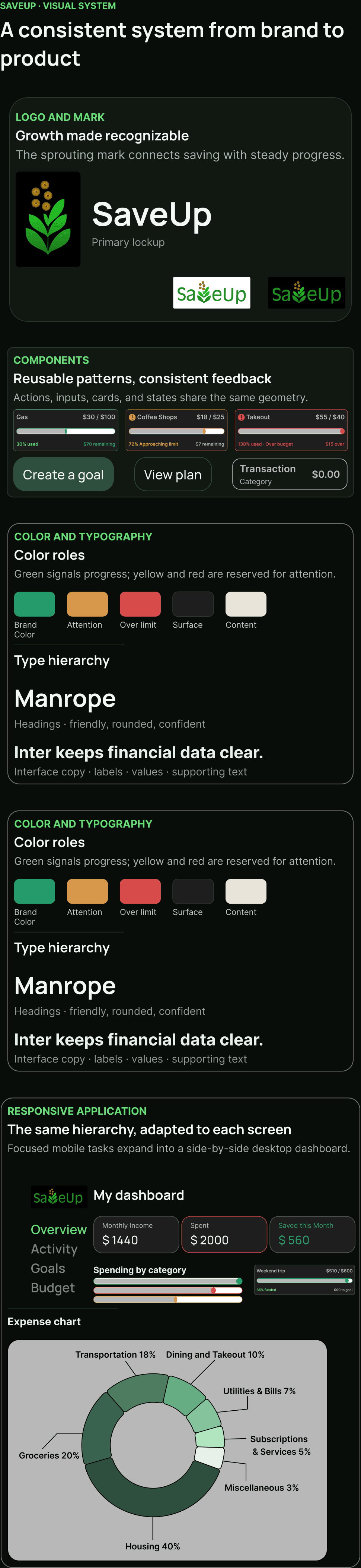
The SaveUp logo was designed to feel approachable and flexible across light, dark, and colored backgrounds. The tree icon can also work independently at smaller sizes to support brand consistency across mobile and desktop contexts.

Testing and Iterations


Hi-Fidelity Screens


Takeaways
What I Learned
Changing "budgeted" to "planned" taught me how much copy affects user confidence with money.
Participants valued clear progress feedback more than complex budgeting controls.
Visual clarity and motivation are inseparable in fintech because users disengage when the data feels overwhelming.
Next steps
Retest the revised terminology, warnings, and transaction structure.
Develop and test the responsive desktop experience.
Validate AI-personalized savings plans before expanding the feature.
Explore bank and spreadsheet integrations only after validating demand.