Water Access Initiative
Responsive website redesign for a nonprofit clean-water initiative
Drop of Water NGO · Pro bono consulting via Taproot
Overview
Role:
Organization:
Drop of Water NGO
Timeline:
4 weeks
Status:
Homepage direction approved
Challenge
Context
The four-week Taproot engagement focused on auditing the existing experience, defining a visual direction, and designing a responsive homepage with reusable components.
UX Audit
Design opportunity
Design Response
Mission and impact were difficult to identify quickly
Introduced a mission-led hero with impact-oriented messaging
Primary actions lacked clear visual priority
Made Donate the primary CTA and Partner the secondary CTA
Visual language was inconsistent
Defined a unified system for typography, color, imagery, and components
Content was fragmented across the experience
Reorganized the homepage around mission, impact, approach, stories, and action
The Brief
The client requested a mission-led homepage featuring its four-pillar approach, impact metrics, community stories, and clearer paths to donate or partner. The design also needed reusable components that could scale to future pages.
Research and Visual Direction
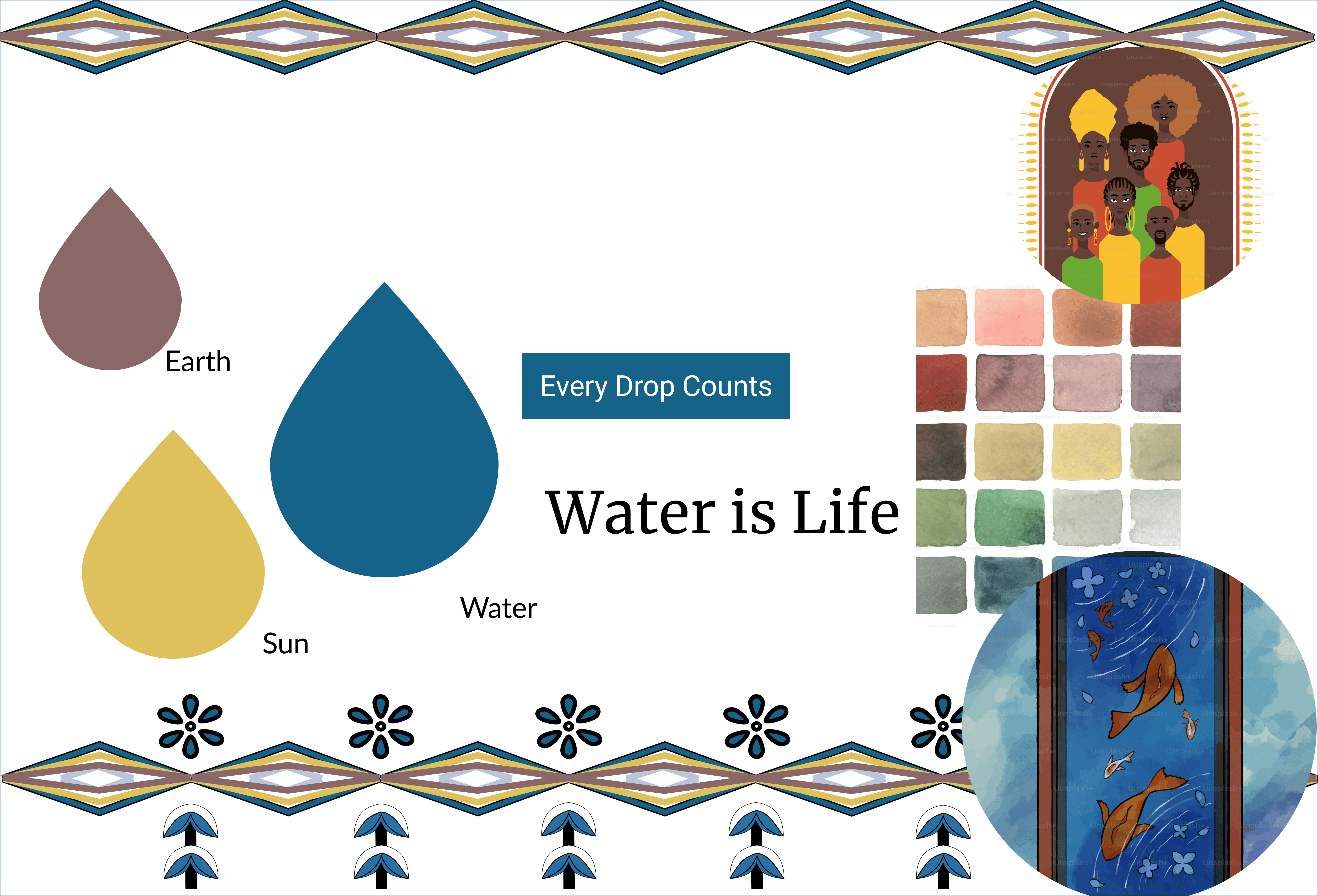
Moodboard
Calm and credible -r estrained blue and earth tones
Human and immediate - documentary community photography
Culturally grounded - I created a custom geometric pattern in Figma, drawing inspiration from Ethiopian decorative motifs to bring cultural specificity into the visual system without relying on a generic nonprofit aesthetic.
Turning the Audit into a Clearer Homepage Narrative
I reorganized the homepage so visitors could understand the mission first, see evidence of impact, learn how the organization works, and then choose how to help.

Design System
Beyond the homepage, a complete design system with color scales, typography hierarchy, accessibility standards, component library, and reusable building blocks was built to support future pages.
Cards and Icons

Colors, Typography

Components


Timeline
Audit and alignment
Reviewed the existing site, references, goals, and project scope.
Visual direction
Developed and aligned on a moodboard and two homepage directions.
Design and iteration
Refined hierarchy, CTAs, color, and reusable components through feedback.
Homepage deliver
Delivered an approved responsive homepage direction and visual system.
Outcome and Reflection
During the four-week engagement, I audited the existing experience, reorganized the homepage content, developed the visual direction, designed the responsive interface, and created reusable components for future pages.
The selected homepage direction and visual system were approved. The engagement concluded before additional pages were designed or the website was implemented.