Responsive HTML/CSS Portfolio Website
I designed and coded a responsive portfolio to strengthen my front-end understanding and improve designer-developer collaboration
Solo Project, 2024
Tools
HTML / CSS / JavaScript
VS Code
GitHub
Figma
Context and Challenge
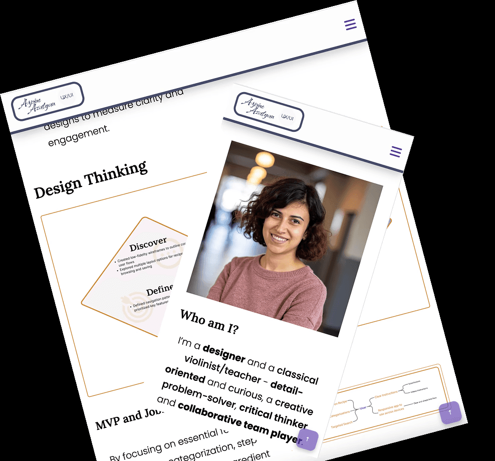
Coming from a music background, I needed a portfolio that could establish credibility quickly, showing both my design thinking and my ability to translate visual decisions into functional code.
A traditional résumé couldn't fully capture the story or demonstrate the technical range. I needed a portfolio that showed design thinking and proved I understood how design decisions translate into functional code.
Challenge 1
Storytelling
Framing a non-linear career path in a way that feels intentional and credible -without over-explaining it.
Challenge 2
Skill Demonstration
Show design fluency while also demonstrating a working understanding of front-end implementation.
Challenge 3
Accessibility & Usability
Building a site that works across all devices and meets usability standards - not just one that looks good at one viewport.
Process and INsights
Gathering Materials
Selected the projects, assets, and personal narrative I wanted to feature establishing what the site needed to communicate before designing how.
Planning & Content Structure
Mapped the sections: About, Projects, Skills, Contact, and defined how they'd flow together to create a coherent, engaging narrative.
Building the Website
User Testing and Iteration
Tested with five users to identify friction in navigation, readand calls to action. Refined spacing, hierarchy, and flow based on what the feedback actually said.
Cross-Platform Testing
Used VS Code linters, W3C validator, and color contrast checkers to ensure consistent performance across devices, browsers, and accessibility standards.
Final Iteration & Launch
Incorporated all feedback, polished the details, and published a working showcase of both design thinking and front-end implementation in one place.
the result
Design
Clear storytelling , career transition framed with intention, not apology
Accessible color contrast and typography across all viewports
Case studies that emphasize process, not just final screens
Development
Fully responsive across mobile, tablet, and desktop
Smooth scrolling and interactive navigation built in vanilla JS
Back-to-top button and performance-conscious implementation
Outcome
A live, responsive portfolio website built and published from scratch.
Demonstrated ability to own a project from concept to shipped code
Deepened understanding of how design decisions translate into implementation constraints
Insights
WHAT I LEARNED
Iteration is the work. Feedback from testing led to the most meaningful improvements, not the initial design decisions
Building from scratch is the fastest way to understand why certain design decisions are harder to implement than they look in only design tools
Framing a career transition is a design problem: the narrative structure matters as much as the visual one.
NEXT STEPS
Migrate to a more robust framework as the project portfolio grows
Add motion and micro-interactions to improve the experience of moving between sections
Continue refining the case study structure as each project deepens in documentation