
MuseMatch
MuseMatch is an intent-first native Android and iOS app designed to connect creatives with collaborators, mentors, and sponsors. It's meant to transform networking into meaningful relationships, helping artists turn inspiration into projects and conversations into momentum.
a native Android and iOS social platform
2024
Tools
Figma
Balsamiq
ChatGPT
Pen and Paper
Microsoft Office
My role
Solo UX/UI Designer
The Gap (The Problem)
Finding the right people has always depended on who you know, where you studied, or whether you were in the right room.
Existing platforms support skilled creatives, but they solve different problems. Patreon focuses on fan monetization, while Skillshare focuses on skill acquisition. MuseMatch addresses the gap between them: helping creatives find collaborators, mentors, or sponsors based on creative intent.
I know this gap firsthand. As a classical violinist, I saw how often creative opportunities depended on informal networks. MuseMatch began as a response to that gap.
Hypothesis
I designed MuseMatch for someone with real skill, real ambition, and no clear path to the right people.
MuseMatch is an intent-first creative network where users choose what they need (collaboration, mentorship, or sponsorship) and receive curated matches aligned with their goals. At the core is MuseAI, a chatbot that asks clarifying questions and surfaces relevant matches based on intent and complementary skills. The goal is to make creative networking more purposeful and less dependent on chance.
WHO IT'S FOR
Two patterns came up across the research:
"I know what I want to create. I just don't know how to find the people who get it."
"Networking feels fake. I want to find people who are serious about their craft, not just building a following."
Visibility and authenticity drove the design decisions that followed


Competitor analysis/ Market gap


Conclusion
Organize the experience around user intent, not content consumption.
From user needs to Design decisions
Each design decision responded to one of two user signals: what creatives wanted to accomplish and what they needed to feel confident taking the next step.

Feedback, Social Proof & Growth
Endorsements and peer reviews built into profiles. Every interaction leaves a visible record of creative credibility.
Mentor-Mentee Matching
The three-path onboarding gives the matching algorithm the right context from the start.

Filtering by Skill & Availability
Filters reflect not just what users do, but how and when they work.
Secure Communication
Trust, clarity, and simplicity were non-negotiable in every touchpoint of the messaging flow.
THE STRUCTURAL DECISION: THREE PATHS
User flow
Start with intent → choose AI-guided conversation or manual search → review matched creatives → connect

wireframes
I mapped three core user paths: collaboration, mentorship, and sponsorship. Focused on AI onboarding flow structure and information architecture. No visual decisions at this stage.
Low-Fidelity
Mid FIdelity
Hi Fidelity
Applied usability testing findings. Tightened navigation consistency, differentiated AI chat paths, and aligned visual language across iOS and Android.
iOS
Android

Testing and iterations
6 Participants
Usability Testing
iOS & Android
Peer Design Review
Testing Scenario
Participants were asked to complete three core tasks: find a collaborator, connect with a mentor, and navigate the messaging flow — simulating a realistic first-time user session across both platforms.
What worked
Sign-up and sign-in flow completed without friction. SSO via Google and Apple validated as intuitive.
Persistent header and footer reduced navigation confusion
Visual design and dark background received consistent positive responses
Onboarding tone and personal info section described as comfortable and welcoming
Artist profile layout and visual hierarchy rated positively
All participants completed the full user journey: opening through profile, notifications, and settings
What needed to improve
Muse AI chat paths resolved to the same generic screen - flagged by 4 of 6 participants
Back button and notification routing inconsistent, tapping notifications redirected to artist profile instead of notification center
Category views (Theatre/Film, Writing) not fully scrollable. Home screen also not scrollable below the fold.
Color palette flagged as too varied, reduction for visual cohesion recommended
"Let's find your muse" copy unclear when intent was mentorship or sponsorship
What I changed
Fixed scroll behavior across all category views and home screen.
Reduced color palette to core teal range plus single coral accent.
Rewrote intent-routing copy to match the three-path architecture.
Resolved notification routing inconsistency.
Differentiated MuseAI chat end states per category path. → See iOS chat screens
Visuals
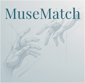
The Visual Mark
The visual identity grew from Michelangelo's Creation of Adam. Two hands reaching, the platform connecting creatives who would otherwise miss each other. Renaissance engravings carry the metaphor through the navigation cards. The concept was mine; AI executed the imagery

Eye-catching, symbolic visuals are layered behind each navigation card - adding mood, texture, and a sense of atmosphere without competing with the content. Each image is carefully chosen to evoke one of the artistic “muses,” subtly guiding users as they explore different creative paths. The result is a balance of clarity and emotional tone that elevates the overall experience.


Color and typography


Takeaways
Intent-first architecture has compounding effects. The three path split didn't just shape navigation. It shaped what MuseAI asked, which matches surfaced, what trust signals mattered.
Optional AI is more useful than mandatory AI. Search and filters as a parallel route gave users control over how much they wanted the system to interpret for them
Six participants is enough if you act on what you find. The discipline isn't in running the test. It's in tracing every fix back to a finding.
Next steps
Refine AI chat end states across collaboration, mentorship, and sponsorship.
Run a second usability test focused on navigation and messaging.
Build out messaging center with threading, project boards, file sharing.
Explore sponsorship filters and MuseAI personalization.
