SaveUP
A responsive savings app designed for people saving toward
specific goals without spreadsheet complexity.
Original concept · iOS and desktop · 2024
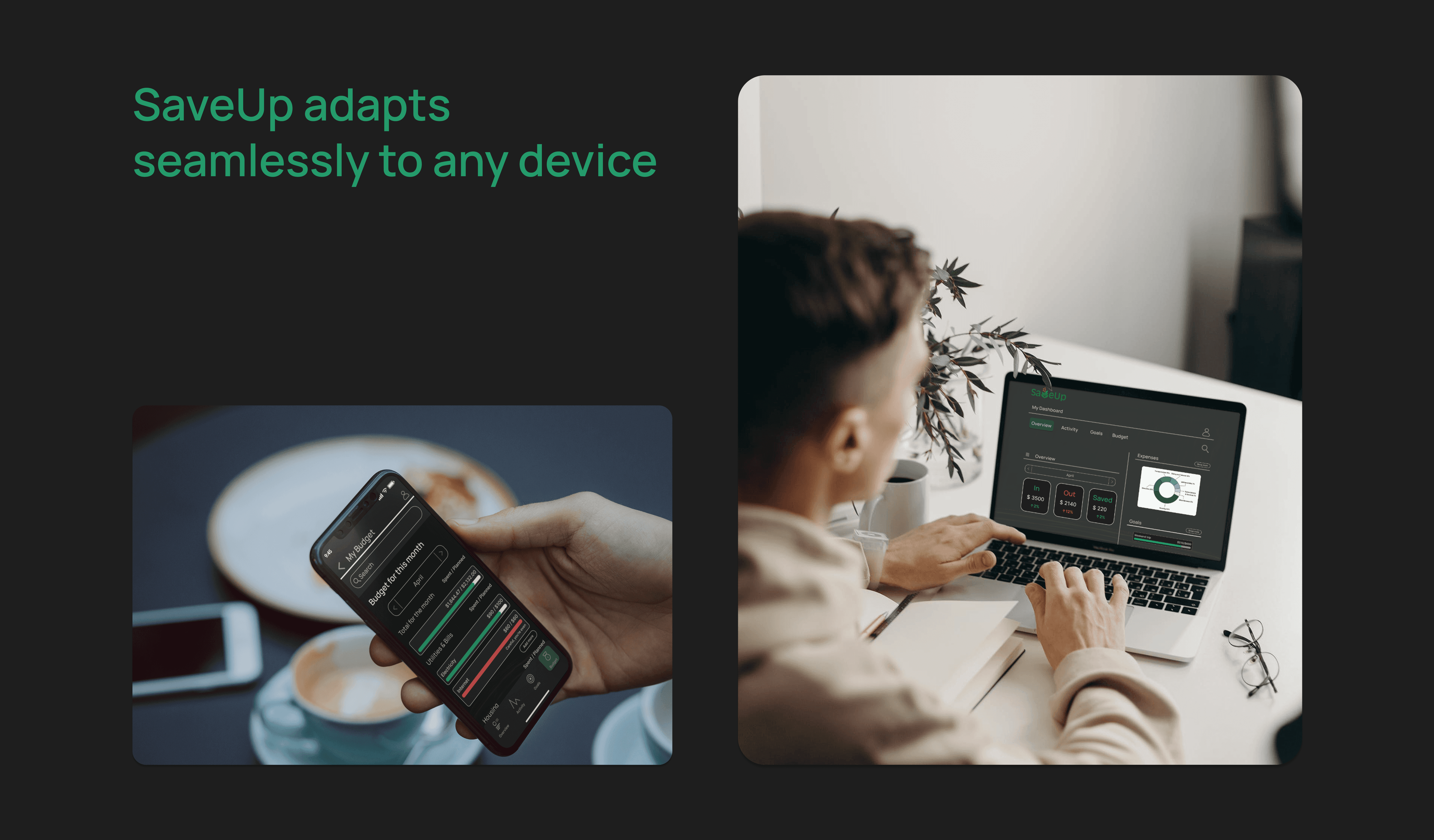
Responsive Savings App
2024
Tools
Figma
ChatGPT
Pen and Paper
Microsoft Office
Balsamiq
My role
Problem
The Problem
Saving toward a specific goal can feel overwhelming when users don’t know how much to save, how often to contribute, or whether their spending is putting them off track.
Saving toward goals within a timeline is a common challenge
Visual feedback is clinical when the user is already stressed about money
The Solution
A cross-platform savings app for users who want to set a goal, track progress, and stay motivated without becoming a personal finance hobbyist.
SaveUp turns goal-based saving into a visual, low-friction habit. Users set a target amount and deadline, receive a weekly savings plan, and track progress through clear dashboards, category feedback, and warning states.
Target Users
Tech-savvy professionals 25–45 saving for meaningful goals
Core Need
Visual clarity and motivation without spreadsheet complexity
Design Approach
Goal-first flows · Data visualization · Cross-device
User Context

Key User Needs

Visual Finance Overview
"I want to see how much I'm spending on what"
Design Decision
Built the dashboard around category-based spending rings, with progress bars showing where each category sits against the planned amount and a persistent summary at the top.
Personalized Savings Plan
"Tell me how much to save each week so I actually hit the goal"
Design Decision
Built a goal-setting flow that takes target amount and deadline, then generates a weekly savings breakdown, making the path to the goal concrete and actionable.

Income & Expense Input
"I keep forgetting to track what I bought."
Design Decision
Designed a transaction entry flow with category tagging and a collapsible transactions page. Tested and refined based on direct user feedback.
Goal Deadlines & Progress
"I want to know when I'm overspending before it's too late."
Design Decision
Added budget warning indicators for categories at or over the planned amount, and renamed "budgeted" to "planned" after testing revealed the original label caused confusion.
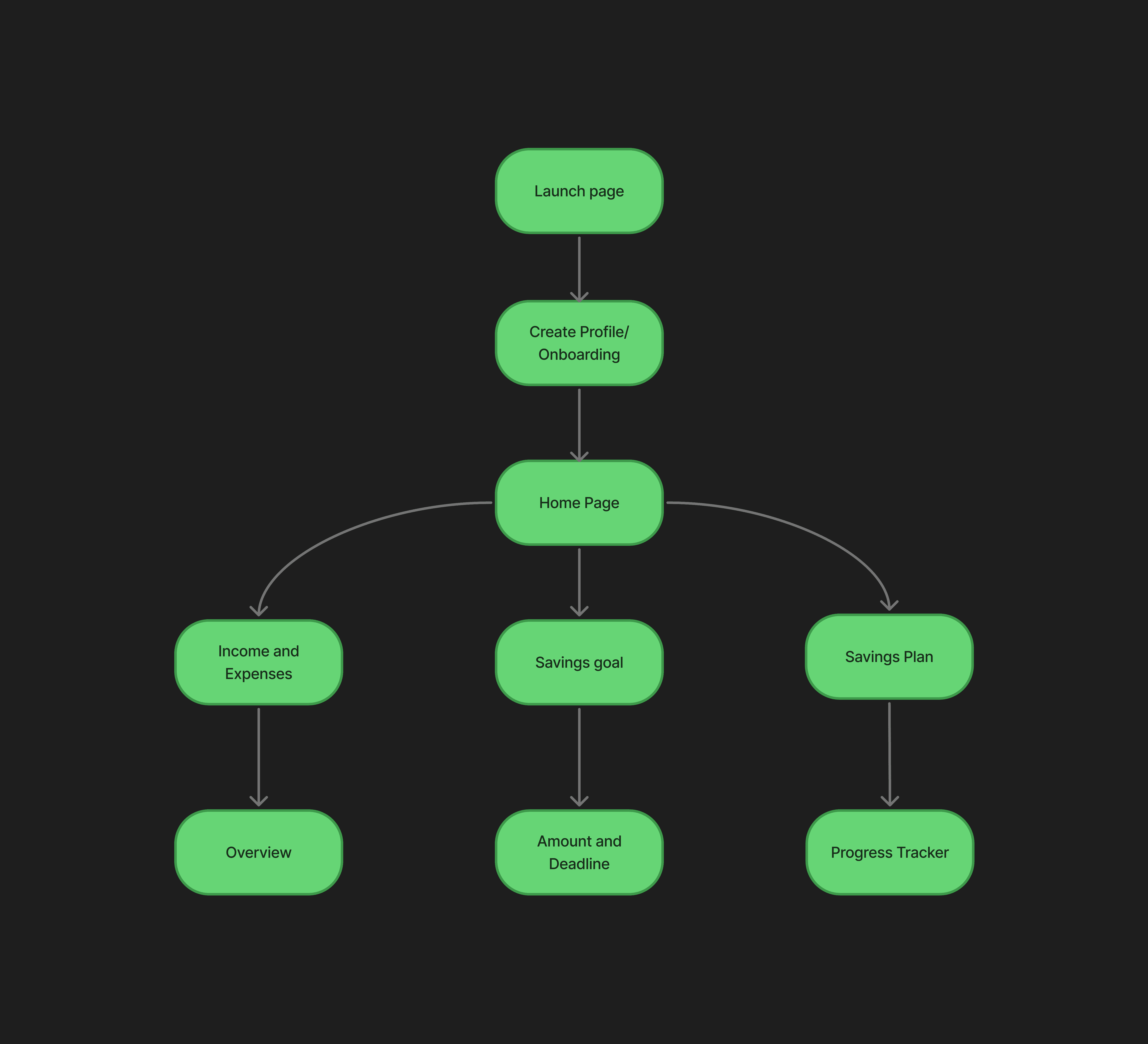
User flow
Step 1
Step 2
Step 3
Step 4
Step 5
wireframes
Low-Fidelity
Mid-Fidelity
I mapped the core user paths for expense tracking, goal setting, and progress review before moving into high-fidelity screens.

Testing and iterations
3 Participants
Usability Testing
Testing Scenario
As someone who’s trying to save money for a specific goal (like a trip, a big purchase, or paying off debt) explore the app and tell us how the experience feels.
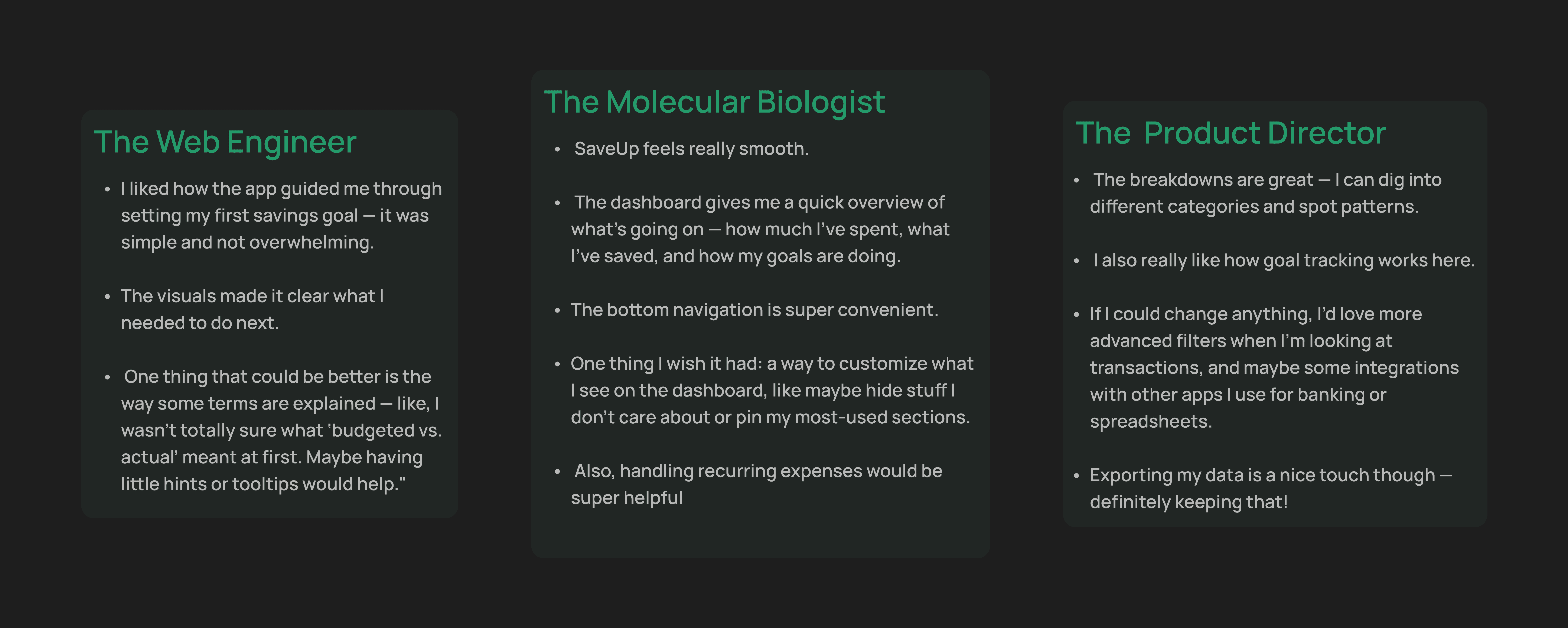
What worked
Dashboard visual hierarchy rated clear and easy to scan
Goal-setting flow completed without guidance
Visual design and color system received positive responses
Onboarding flow felt intuitive and low-friction
What needed to improve
Transactions page felt static, users expected collapsible sections
Dashboard lacked personalization, users wanted to customize their view
"Budgeted" label caused confusion, unclear if planned or already spent
Budget categories at or over limit had no warning signal
Changes Made After testing
Renamed “budgeted” to “planned”- this eliminated the confusion whether the mount is already spent or was planned to be spent
Added warning indicators- categories at or over the planned amount needed a stronger signal.
Improved transactions page - users expected collapsible sections, so the structure was revised to support easier scanning.
Hi -Fidelity screens

Takeaways
What I Learned
Designing SaveUp emphasized the importance of balancing simplicity with functionality.
Changing "budgeted" to "planned" taught me how much copy affects user confidence with money.
Visual clarity and motivation are inseparable in fintech because users disengage when the data feels overwhelming.
next steps
Refine budgeting flow, enhance filters and category management
Explore bank and spreadsheet integrations for seamless data tracking
Improve onboarding with AI-personalized savings plans
Scale desktop version and conduct additional cross-platform testing
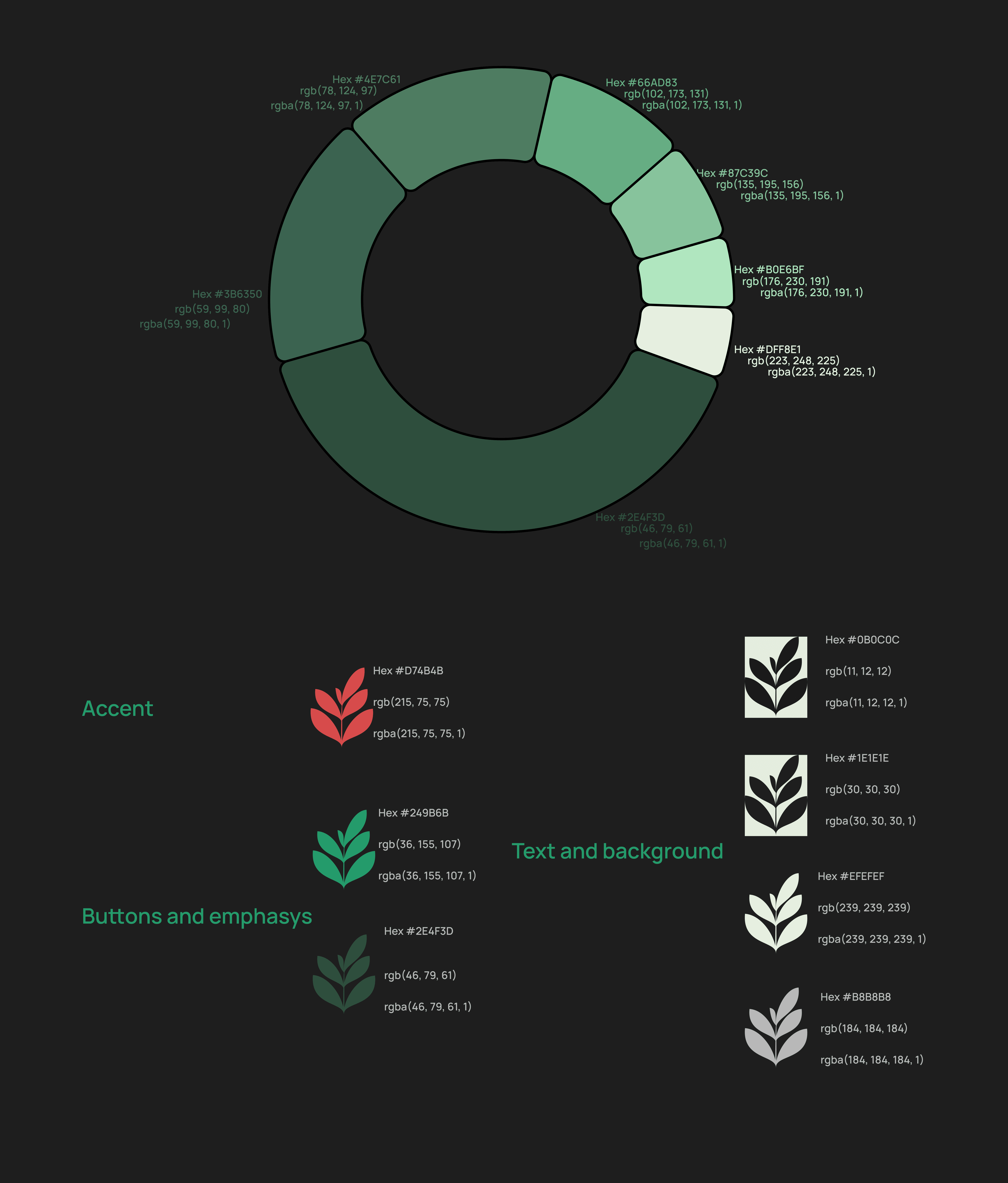
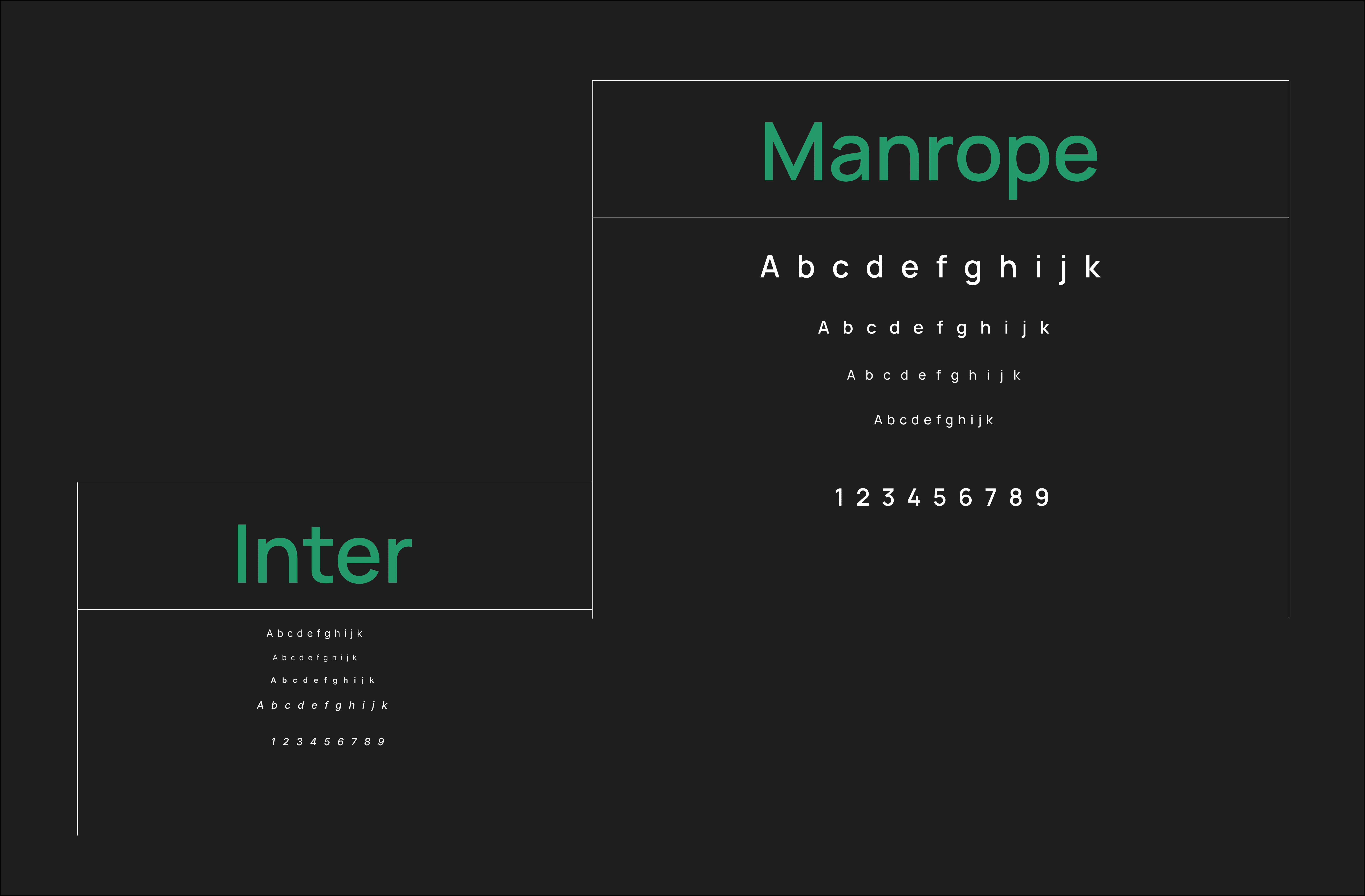
Visuals
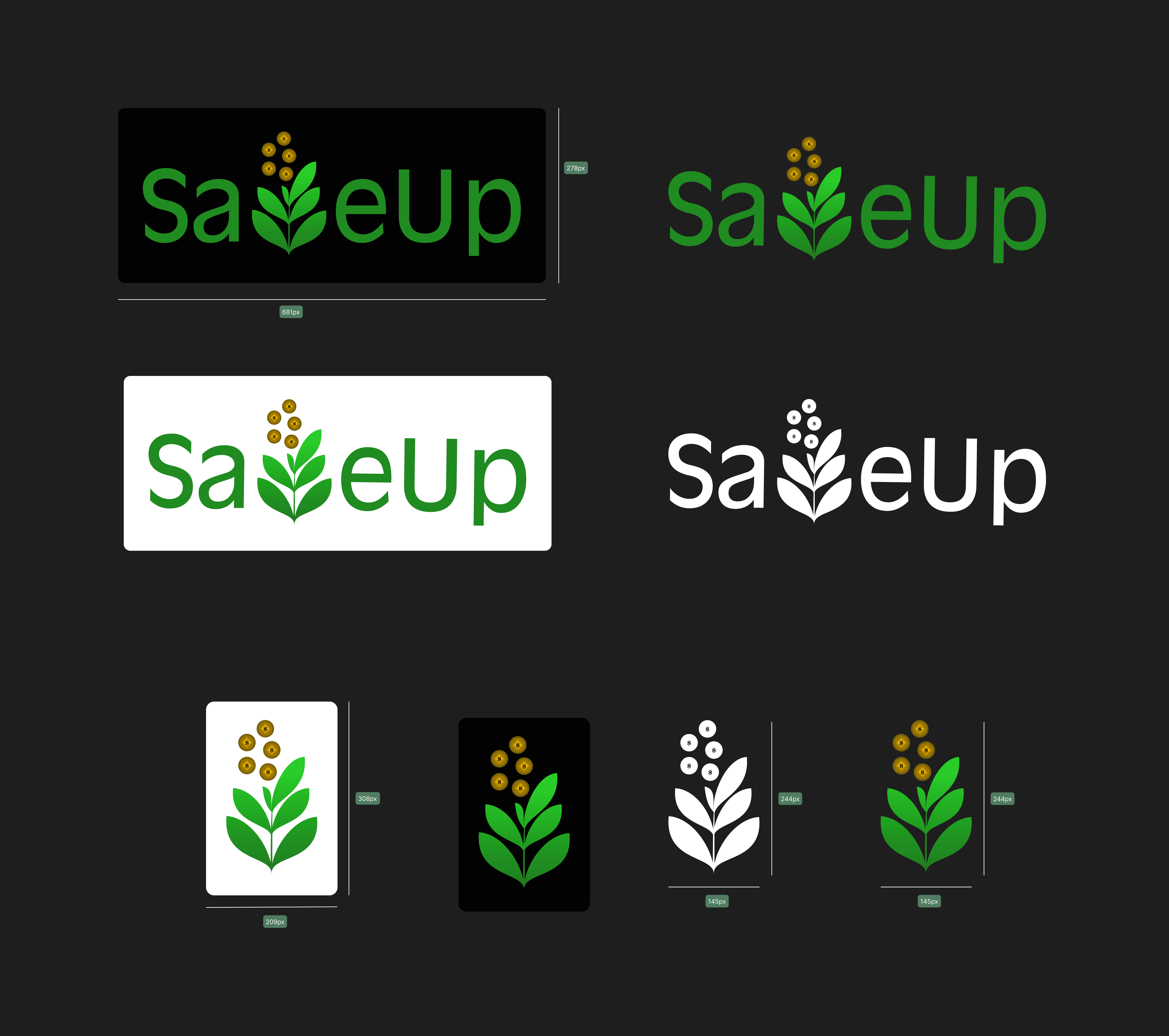
Logo
The SaveUp logo was designed to feel approachable and flexible across light, dark, and colored backgrounds. The tree icon can also work independently at smaller sizes to support brand consistency across mobile and desktop contexts.
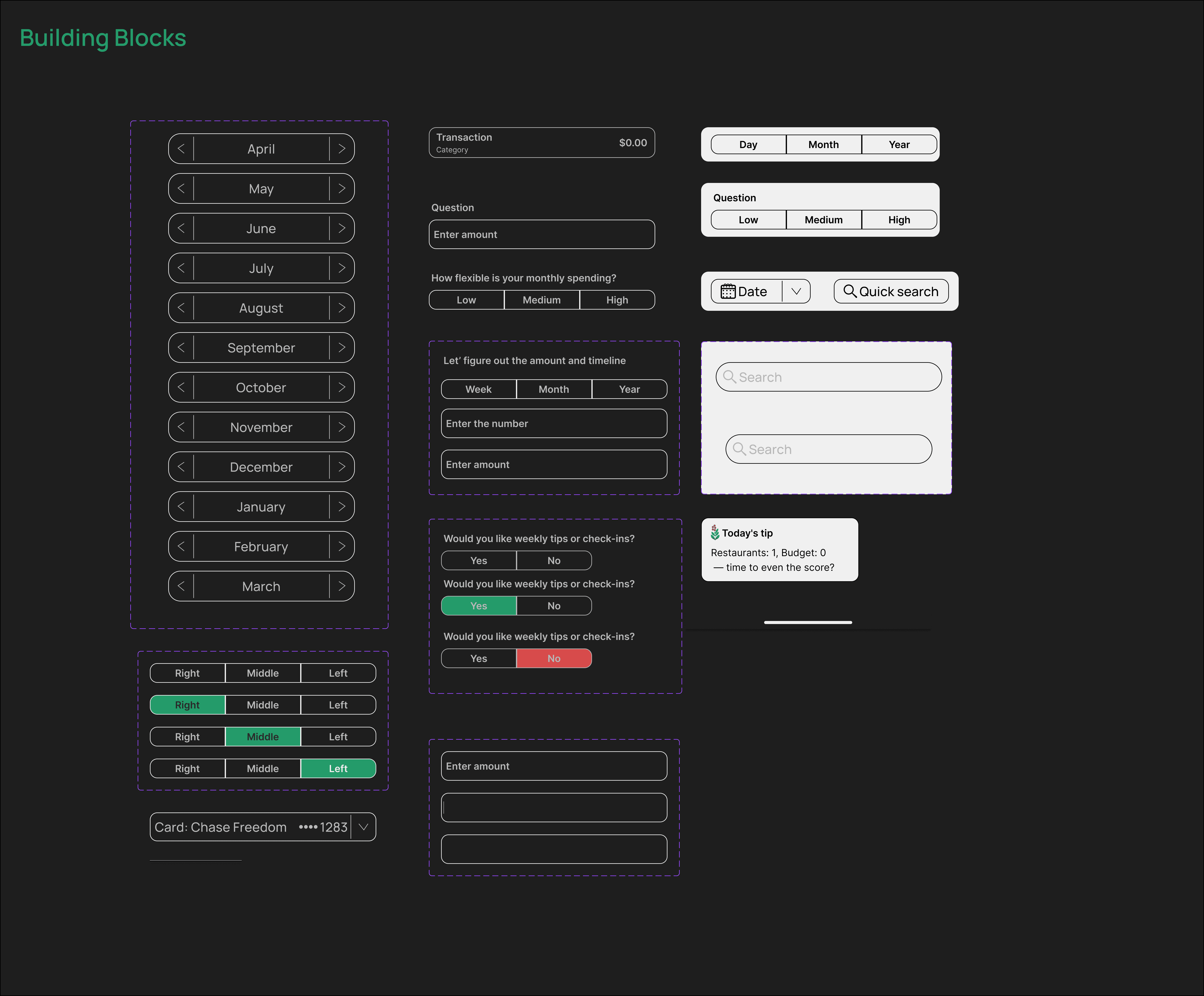
Component Examples
Color and typography