


sip and savor
Mobile First Recipe App
2024
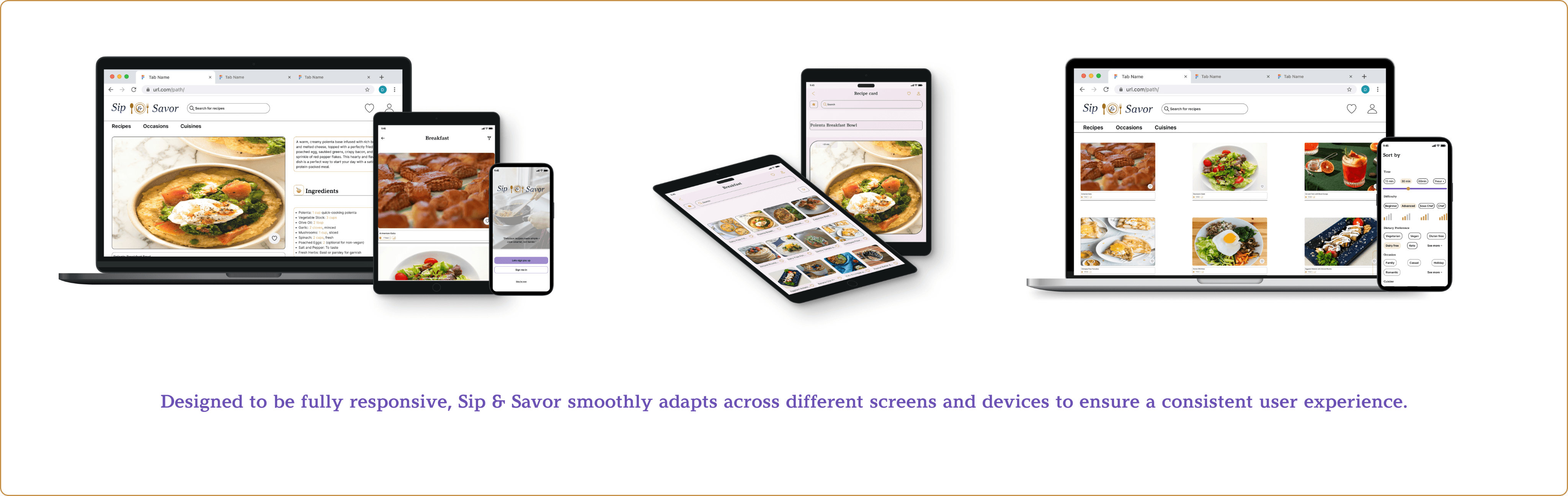
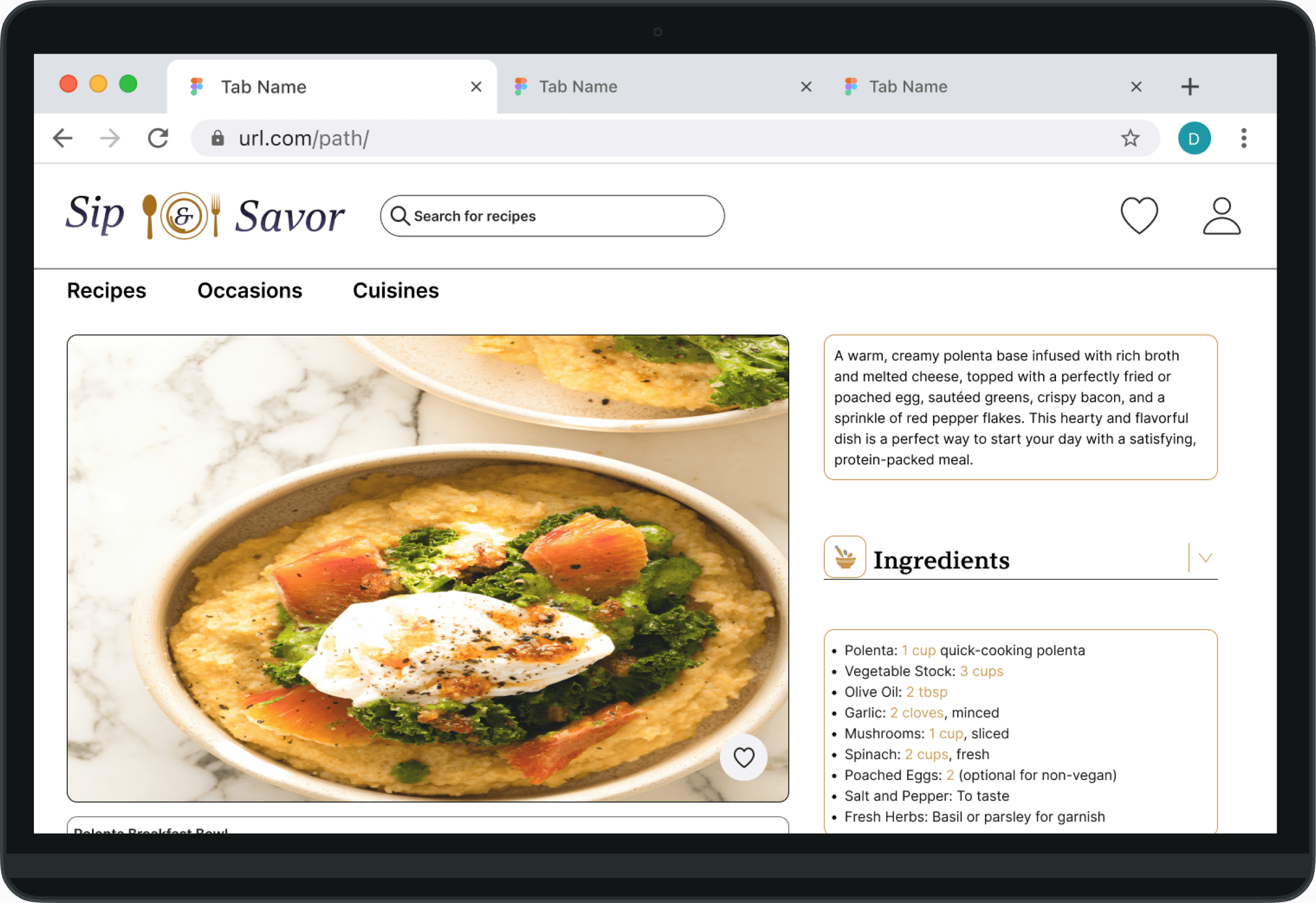
Sip and Savor focuses on creating a recipe app designed for busy young professionals who find meal planning and cooking stressful. Unlike many existing apps with cluttered navigation and limited flexibility, this app emphasizes quick, healthy, and easy-to-follow meals. Core features include simple navigation, recipe saving, step-by-step instructions, and smart ingredient substitutions - making cooking faster, easier, and more enjoyable.
Tools Used
Figma
Chat GPT
Pen and Paper
Microsoft office
Solo Project
Problem Statement
The Problem
Busy young professionals find meal planning and cooking time-consuming. Existing solutions add friction rather than removing it.
The Solution
A mobile-first recipe app that brings up quick, healthy meals and removes every unnecessary step between a user and their next meal.
Target Users
Core Need
Design Approach
Design Thinking Framework


5 Ws
HOW
The Approach
WHAT
The App
WHEN
The Moment
WHY
The Need
Wh0
The User
Jobs to be done
When I get home after a long day, I want to find a quick, healthy recipe using what I already have, so I can cook without wasting time or ingredients.
This core job statement drove the MVP of Sip and Savor. Users aren't looking for culinary inspiration, they're looking for a reliable, fast meal to prepare wit "what's in my fridge".

User Persona
Persona 1


User Flow Diagram

Style guide
moodboard
Gathered visuals, colors, and textures to capture the overall feel and guide the app's aesthetics . The palette leans warm and approachable.

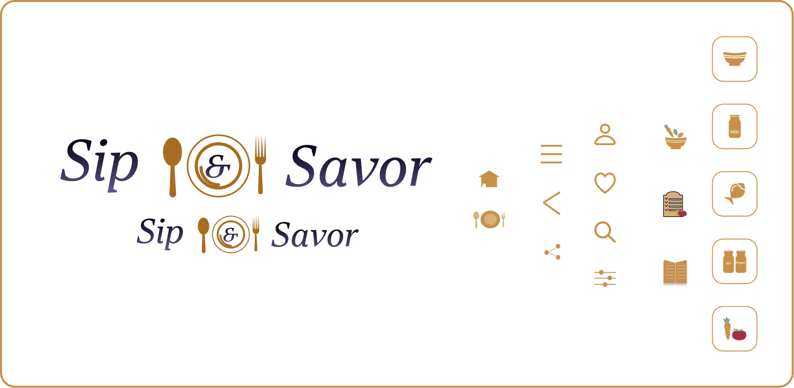
Logo and icons
The design invites the user to enjoy both food and drink. The gold color at the center adds a touch of sophistication. The logo is fully scalable across screen sizes. All icons were custom-designed to ensure visual consistency throughout the experience.
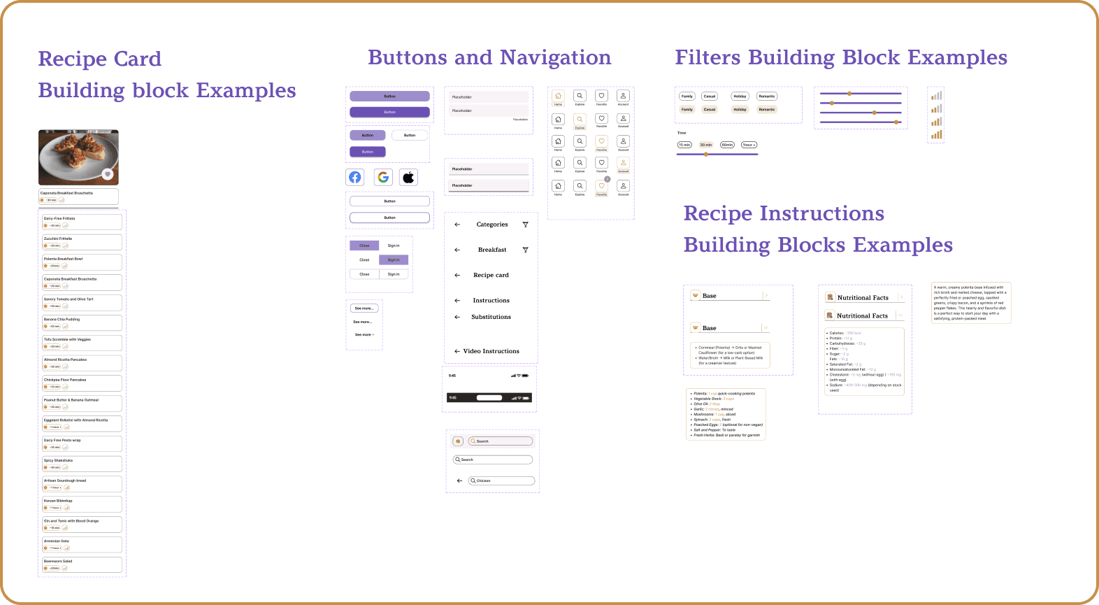
Component Examples
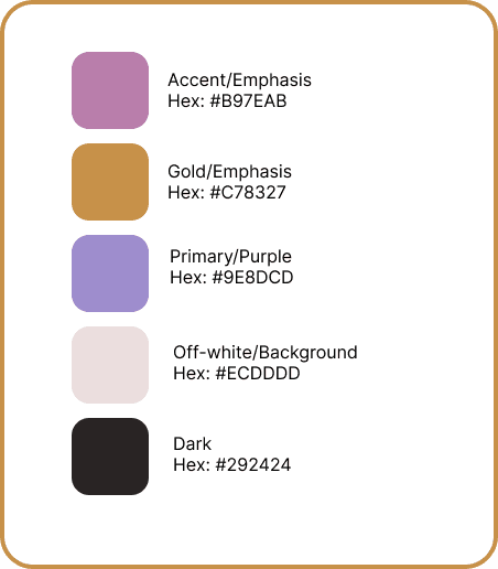
Color and typography

desiGn evolution.Paper prototype

Low-fidelity wireframes. Usability testing
First-time users
Mobile & Desktop
Task-based testing
I conducted usability testing with low-fidelity wireframes to assess how first-time users navigate the app on mobile and desktop- observing whether users could log in, find a recipe, and interact with key functionalities without guidance.
Testing Scenario
What was tested
Sign in and sign up, including SSO via Google and Facebook
Browsing by category and finding a specific recipe
Applying filters and accessing the recipe card
key observations
Navigation flow was intuitive and users completed tasks without prompting
Filter interactions needed clearer visual feedback on selected state
outcome
Validated core navigation structure before committing to high-fidelity
Identified filter UX as a key area to refine in the next iteration
Confirmed that step-by-step instructions required a dedicated cook mode
A/b Testing
The goal of this test was to compare two variations of the homepage logo design to determine which version provided better clarity and engagement for users. 11 participants, across the United States, Germany, and Sweden.

Result
Feedback loop. peer testing
Incorporating feedback from users throughout the design process was crucial. Peer testing sessions helped uncover usability issues, validate design decisions, and guide iterations toward a more user-friendly final product.
I really like the name of the product. It's very catchy.
The gold color is also really nice and gives the recipe app a more regal vibe when paired with the name.
I love the desktop version it has more space between items, and the alignments on the menu bar are good. I think it is a good idea to add transparency to the minutes field on the recipe picture, so that it highlights more when the recipe is selected, maybe you can apply that too all the screens.
Better to center text in the Buttons
Maybe a bit more space between icons will improve usability
Like icon maybe too close to the edge
Is it necessary to use only bold type?
More padding for headline. It's closer to the top bar, but it's related to meals
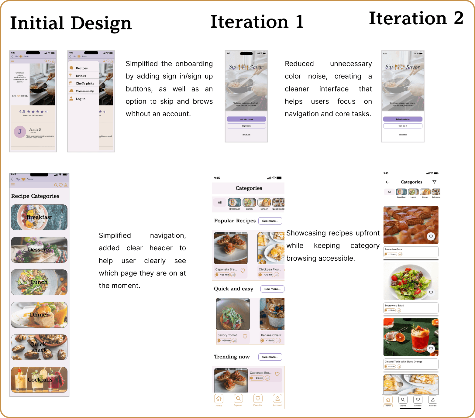
iterations
Sip & Savor began as my second project, created when I was still learning the fundamentals of design. As my skills grew, I revisited it with two focused redesigns first refining the layout and launch screen, then building scalable components to simplify recipe management and navigation. The result is a more modern, user-friendly app that reflects my growth as a designer.

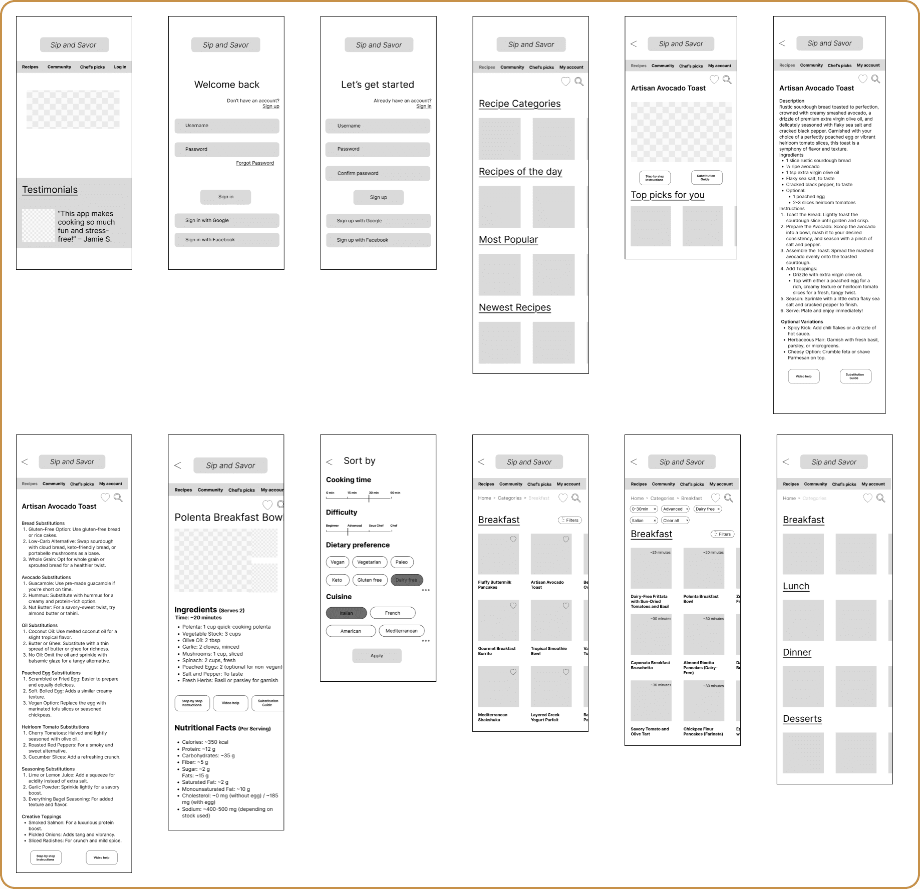
Hi fidelity screens


Takeaways
What I Learned
The importance of testing- usability testing at every stage would have surfaced issues earlier and reduced rework
To gather valuable feedback, recruit participants who genuinely reflect the target audience through clear user criteria, social media communities, screening surveys, and personal network
Designing Sip & Savor reinforced theat the best design decisions are based on balancing simplicity with functionality.
next steps
Create a personalized meal prep plan feature for a more tailored, goal-driven user experience
Explore AI integration to help users utilize ingredients they already have on hand, reducing waste and decision fatigue