Water Access Initiative
Responsive website redesign for a nonprofit clean-water initiative
Drop of Water NGO · Pro bono consulting via Taproot
Discovery · UX audit · Visual direction · Design system
Tools
Figma
Usability/UX Audit
Competitive Analysis
My role
Client
Challenge
Context
The Problem
The existing site did not clearly communicate the organization’s mission, impact, or next steps for visitors. Important information felt scattered, and the visual direction did not fully support the trust, urgency, and human impact behind the initiative.
Mission and impact were not clear enough at first glance.
Visitor actions, such as learning more or supporting the initiative, needed stronger hierarchy.
The visual system needed to feel more trustworthy, calm, and scalable.
The organization
Founded by seven female students at Mekelle University, Drop of Water builds sustainable water and sanitation systems across Ethiopia with a focus on community ownership, youth leadership, and long-term accountability rather than one-off infrastructure projects.
The Engagement
Sourced through Taproot a pro bono professional services platform connecting skilled volunteers with nonprofits. The engagement was timeboxed upfront and scoped to deliver a redesigned homepage direction aligned with the organization's mission and visual identity.
UX audit findings
Unclear hierarchy
Visitors needed a faster way to understand what the organization does and why it matters.
Weak CTA structure
Primary actions were not visually prioritized enough.
Inconsistent visual language
Typography, spacing, and imagery needed more consistency to create trust.
Content needed clearer grouping
Mission, impact, donation/support, and education content needed more intentional structure.
the brief
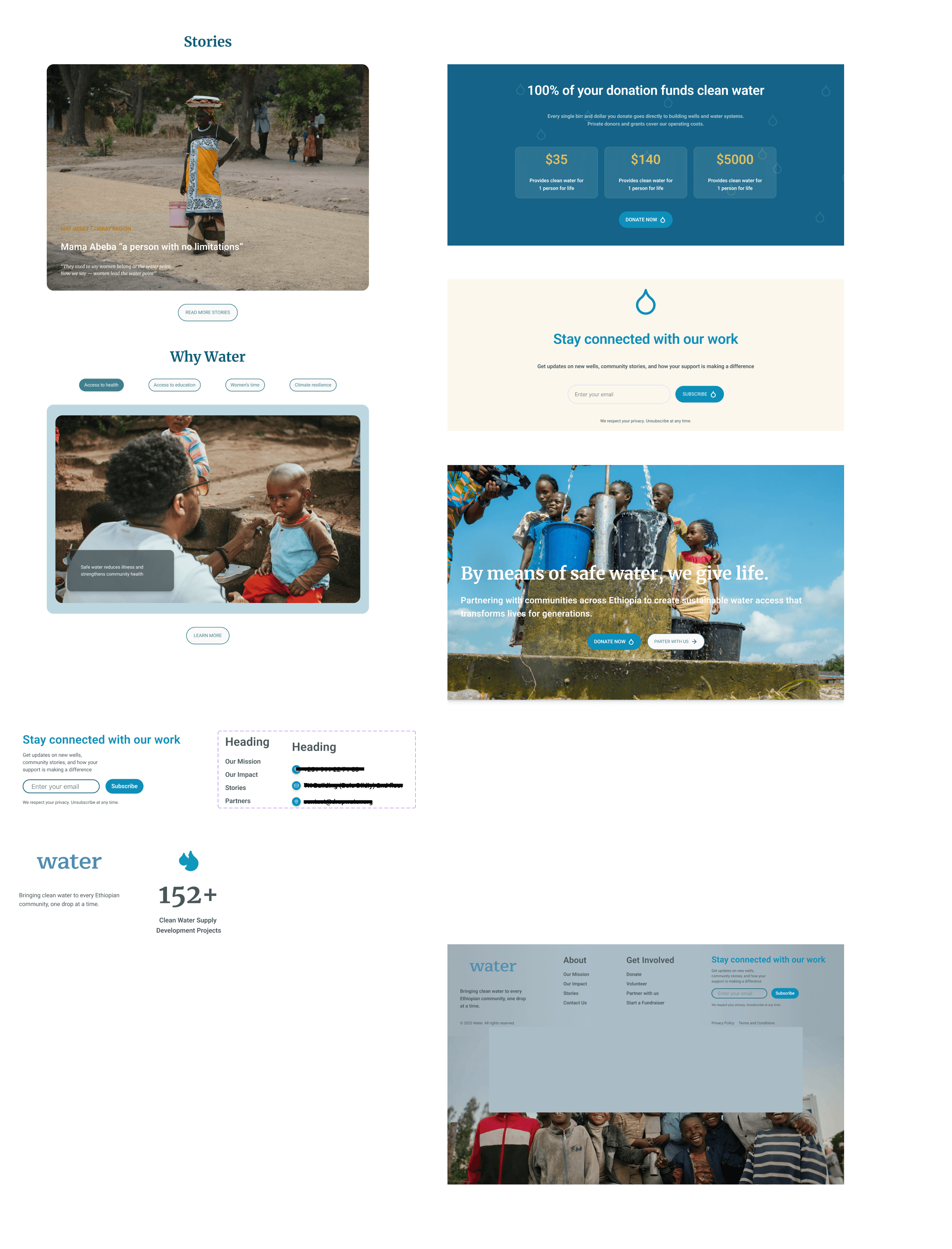
Hero
Full-width image or short video of a water site or community. Tagline: "By means of safe water, we give life." Vision statement prominent above the fold. Donation CTA integrated into the hero.
Core Sections
Hero with mission statement and donation CTA
Four-pillar approach
Impact metrics with annual report integration
Human-centered stories
Partner and donation CTAs
Footer with community imagery and quick links
References
The client provided two comparable NGO websites as visual and structural references pointing toward a clean, image-led, mission-forward aesthetic. Both used strong photography, minimal copy hierarchies, and clear donor conversion paths.
research and visual direction
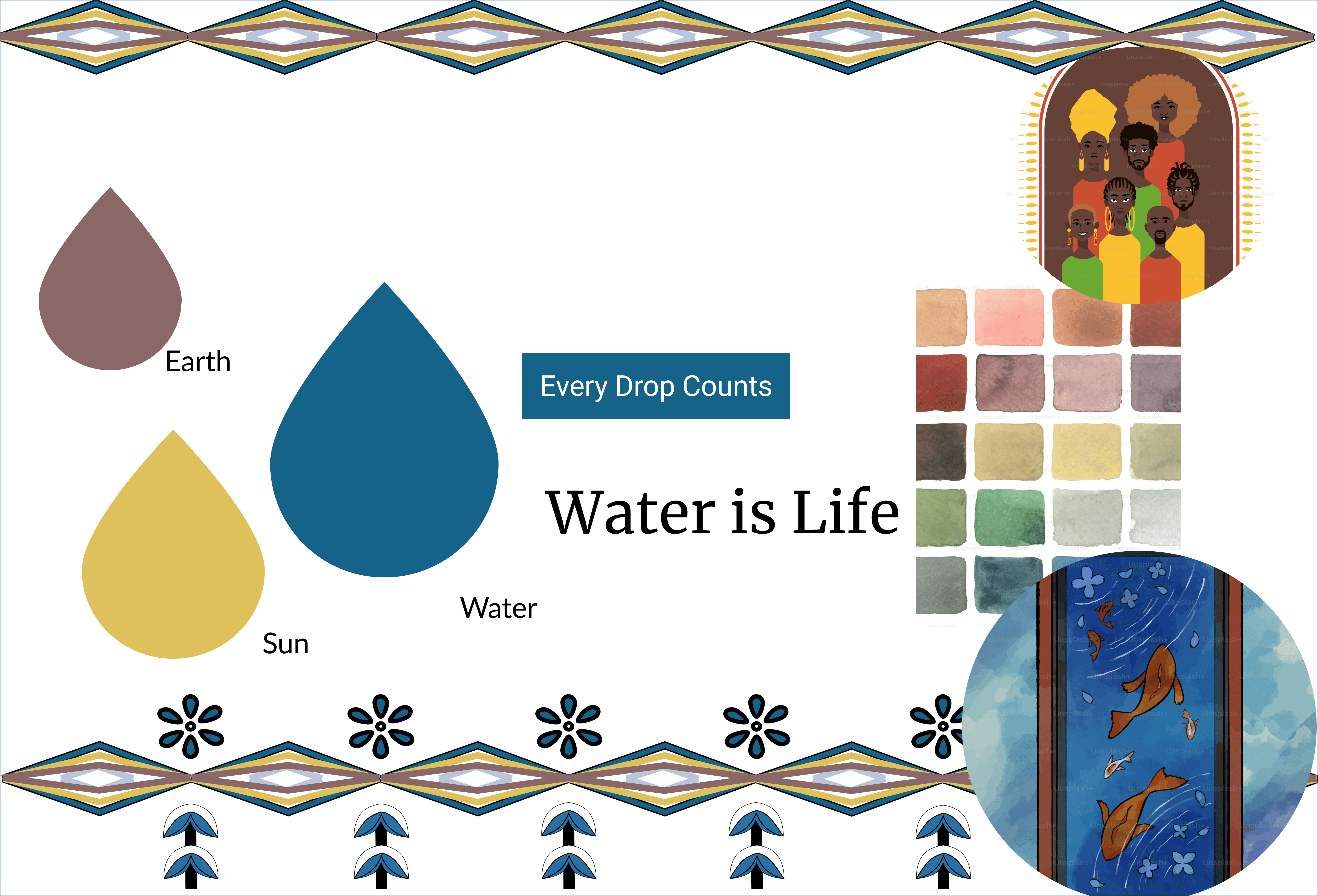
Moodboard
I built a moodboard to translate their values into a palette and aesthetic direction, aligning with the client before producing any screens. The visual direction was designed to feel calm, credible, and human. I used spacious layouts, restrained color, and documentary-style imagery to support the seriousness of the mission without making the page feel heavy or overwhelming.
Approved design Direction
A cohesive homepage with a clear content hierarchy. The client confirmed they were happy with the direction and ready to extend to remaining pages before internal founder misalignment paused the engagement.
Section 1
Hero: tagline + impact CTA
Section 2
Impact stats + annual report.
Section 3
Four-pillar approach
Section 4
Why water · Stories · Partner CTA
Section 5
Footer: community image+quick links

design system
Beyond the homepage, complete design system with color scales, typography hierarchy, accessibility standards, component library, and reusable building blocks was built to support future pages.
Cards and building blocks
Stories · Donation · Hero · Footer · Why Water
Colors, Typography and Accessibility
WCAG AA · Merriweather + Roboto · Full color scale
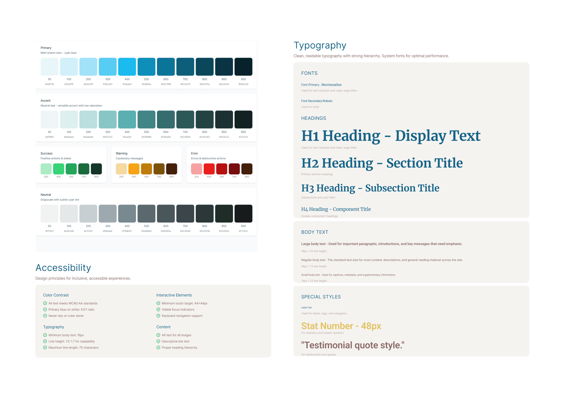
Components
Nav · Icons · Buttons · Donation modal · Background Cards

Timeline - 4 weeks
Brief & Scoping
Initial call
Written brief request
Reference review
Scope, timeline, and deliverables confirmation before starting
Research & Moodboard
Analyzed comparable NGO sites.
Developed a moodboard.
Confirmed alignment before producing final screens.
Design Directions
Produced two homepage directions. Each committed to a different emotional register to best align with client's preferences.
Iteration & Approval
Refined the color system, donation CTA placement, and footer options based on client feedback
Organizational Misalignment → Pause
Additional founders introduced conflicting preferences post-approval. This was identified as an organizational alignment issue (not a design problem). I recommended a formal pause, giving the organization the space to align internally before continuing the work
Insights
What I Learned
This project taught me that design quality depends not only on visual execution, but also on stakeholder alignment. A strong design direction can create momentum, but the project also needs shared decision-making and organizational clarity to move forward successfully.
If I continued the project, I would prioritize a shared content strategy workshop before expanding additional pages.
Design Skills
Brief interpretation: Translated a written document into structured design decisions without a creative director or senior designer to validate against
Visual direction: Developed a moodboard and palette grounded in cultural context, not generic NGO templates
Iteration under real constraints: Responded to live stakeholder feedback across color, layout, and content decisions
Professional Skills
Scope management: Defined the engagement terms upfront and held to them without being rigid or damaging the relationship
Stakeholder diagnosis: Correctly identified that the blocker was organizational misalignment not a design problem requiring another iteration
Professional communication: Closed the engagement clearly, honestly, and constructively in writing, with full context
Real-world ambiguity: The engagement began with a single point of contact guiding the brief and approving the design direction. As the project progressed, additional founders became involved introducing a need for broader internal alignment before the work could continue.
Key Lesson
Good design cannot move faster than the organization behind it.
Relationship
Preserved: invitation to return when internal alignment is reached